
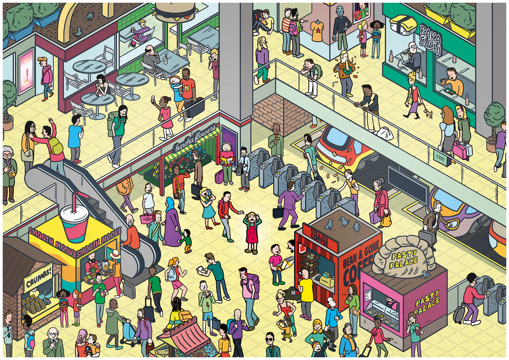
NAS. Too Much Information. Digital.
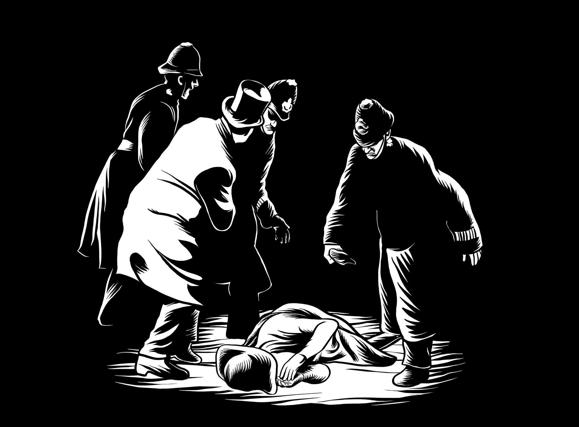
With this portfolio update I wanted to display some of the many styles which I have recently been called-upon to use. Although I have a personal style in which I create work for myself, often a client will want something a little different- more painterly, less dark etc. Over the years I have become more and more comfortable adapting to the style a client desires, though sometimes I am pleasantly surprised, such as the example above for the National Autistic Society. The Illustrations went through a few incarnations before the client asked if I could draw something closer to my personal style, which, I'm happy to say, is the style they finally went with. Below are a couple of earlier examples of the Illustration.
NAS. Too Much Information. Digital.
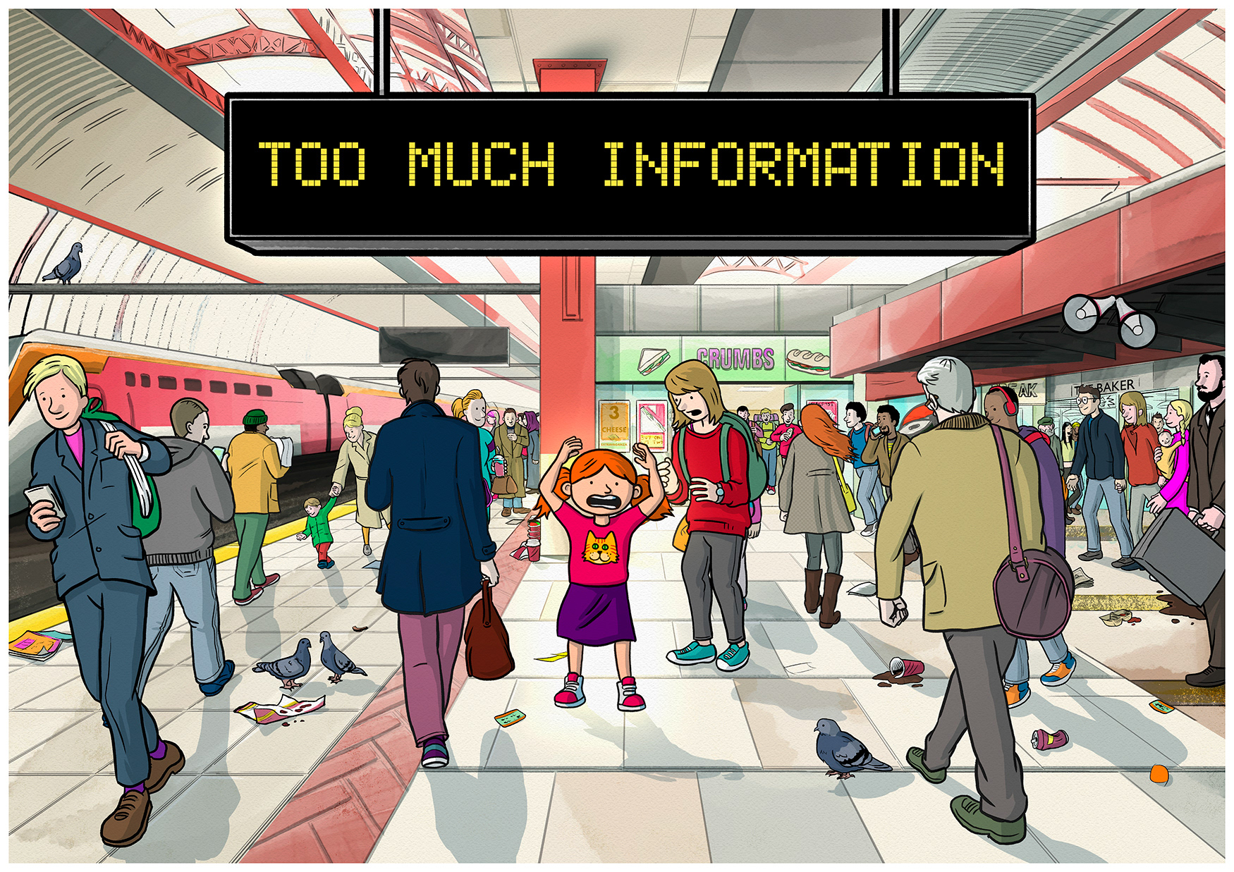
NAS, Too Much Information. Digital.
Below are two digital paintings I made for Save The Children's admirable Literacy campaign 'Read On. Get On.' I had to paint the two in a single day and quickly channel the aesthetic of vintage children's book illustrations.
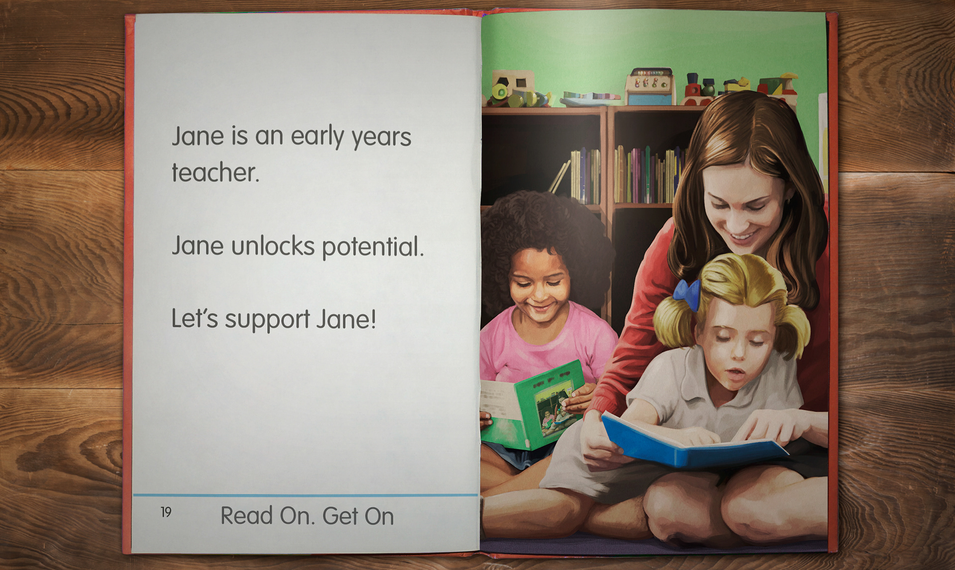
Read On. Get On.Jane. Digital
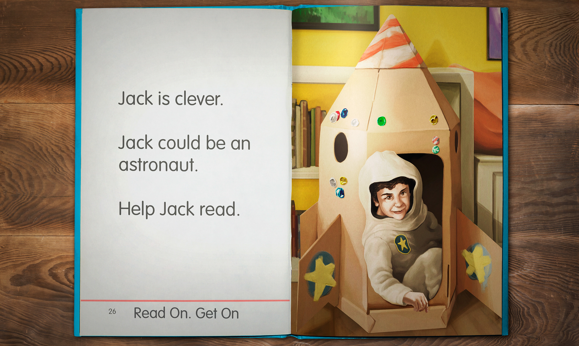
Read On. Get On. Jack. Digital
The next project was an incredibly complex physical challenge- commissioned for the charity BPAS, the images were designed to form points on a timeline of actual moving ink. As the ink followed gravity and poured downwards it would trickle around and form rivulets in the images thus revealing them. This complicated process, involving many tests and gallons and gallons of ink being poured all over my studio, necessitated simple yet striking images that could be laser-cut from white acetate. The final film can be seen here.

BPAS. On the Shoulders of Giants (Emma Watson). Digital.
BPAS. On the Shoulders of Giants (Black Friday). Digital.
Below are several concept pieces for a now sadly defunct, proposed cartoon series I worked on. We wanted a very specific look for the show, with thick black lines and a simplicity to the shapes married to gritty, real-world textures (see bottom images) however, I couldn't resist painting our main character in all of his repugnant glory!
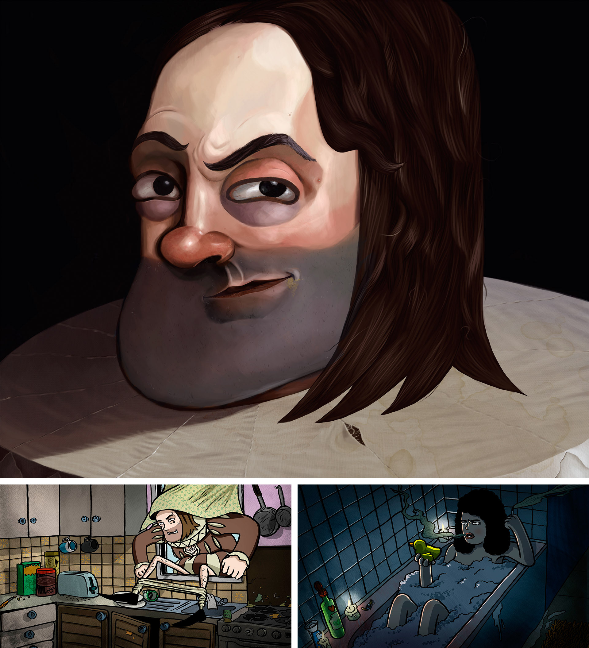
Abandoned Cartoon Series concept art. Digital.
This project, heavily inspired by Soviet-era Socialist posters (and a healthy dose of Shepard Fairey), was used to give a hint at back-story and depth to nDreams' launch campaign for their VR Shooter GUNNER. The key-art I created then went on to inform a whole suite of assets; trailers, icons, banners and posters.
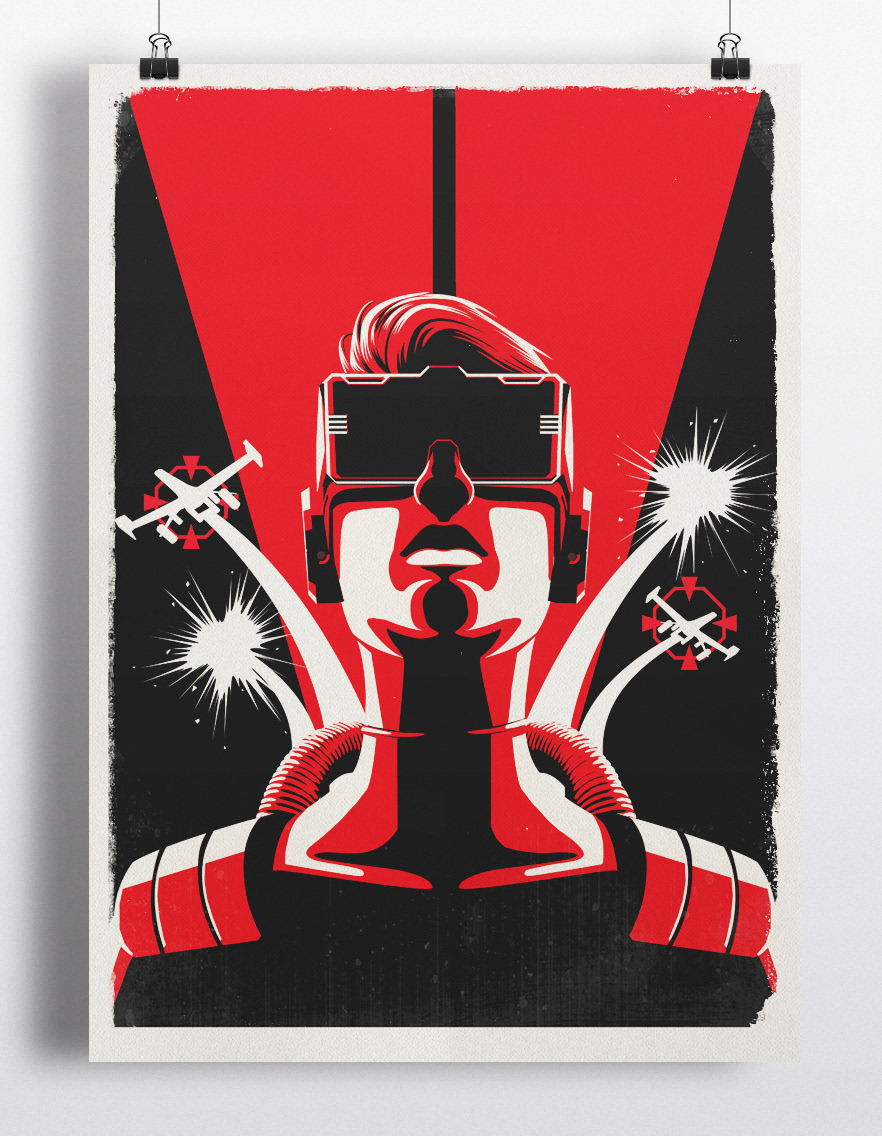
Gunner poster. Digital.
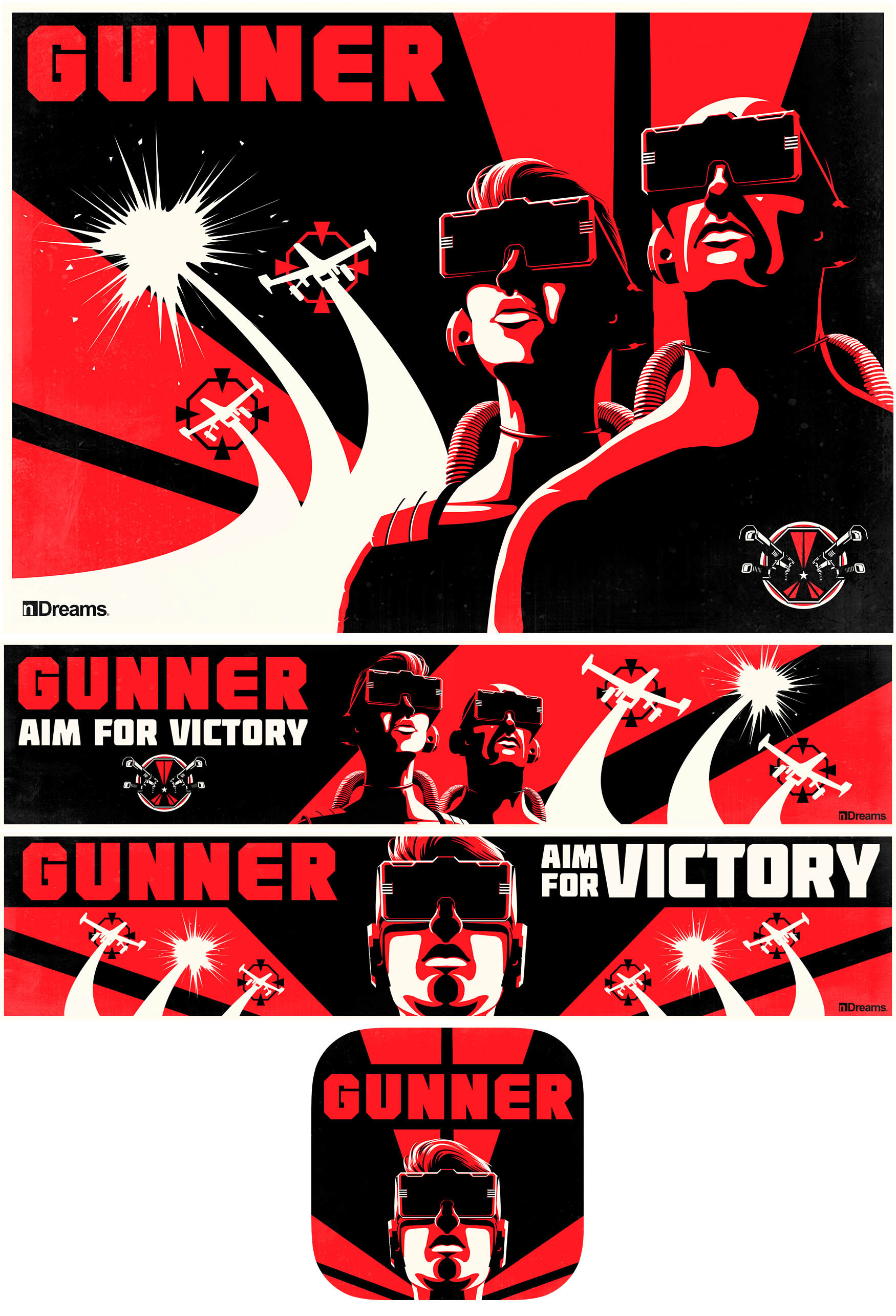
Gunner Asset Suite. Digital.
Finally, below are a few 'Behind the scenes' shots of the insane, sprawling, cardboard recreation of the SEGA IP 'Crazy Taxi: City Rush' that I built (with some excellent help) for the Launch trailer (Here). The whole thing was an amazing experience; from the client saying 'Let's do this', to concepting the piece, building the sets and characters from salvaged cardboard and acrylic paint, overcoming engineering challenges and then filming the whole thing in one manic night! I love it when an idea gets kicked around and then at the end of the meeting everyone looks at me and says 'now you have to make it happen'.
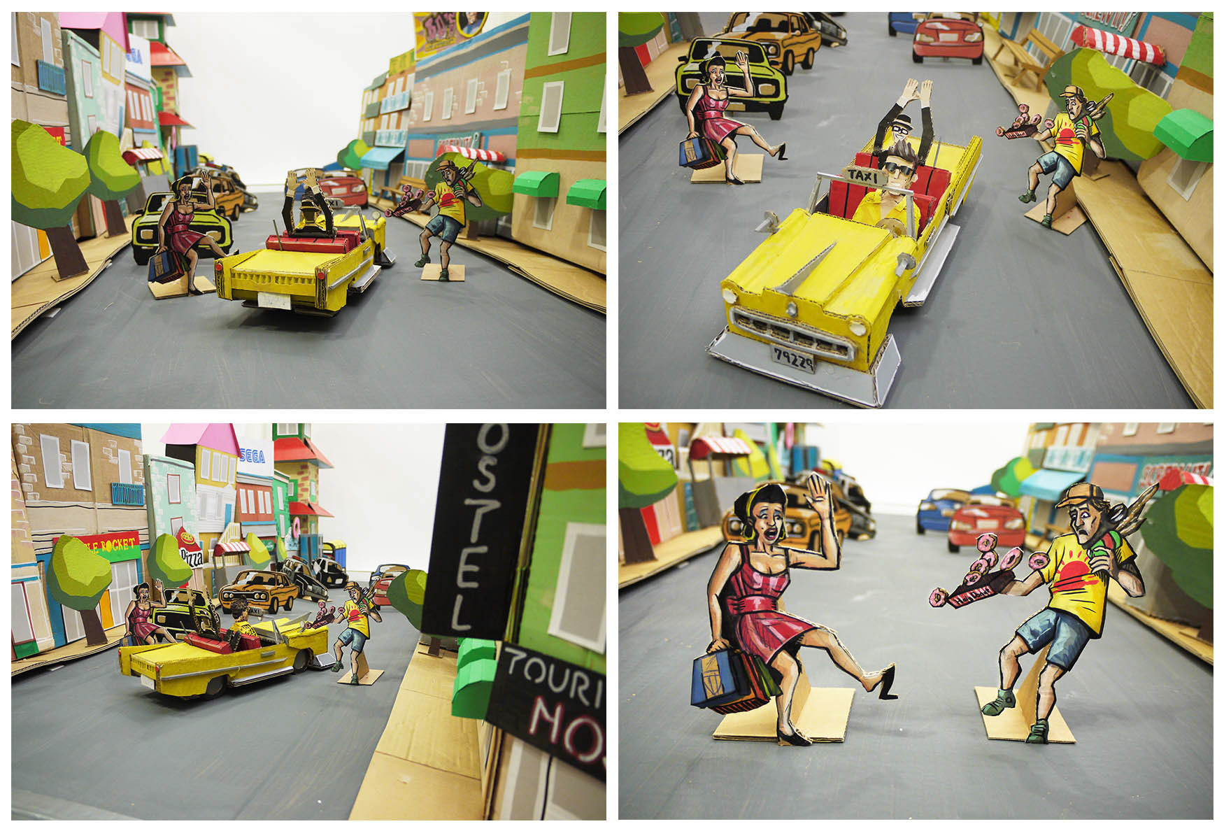
Crazy Taxi: City Rush. Behind the Scenes. Cardboard and Acrylic paint.
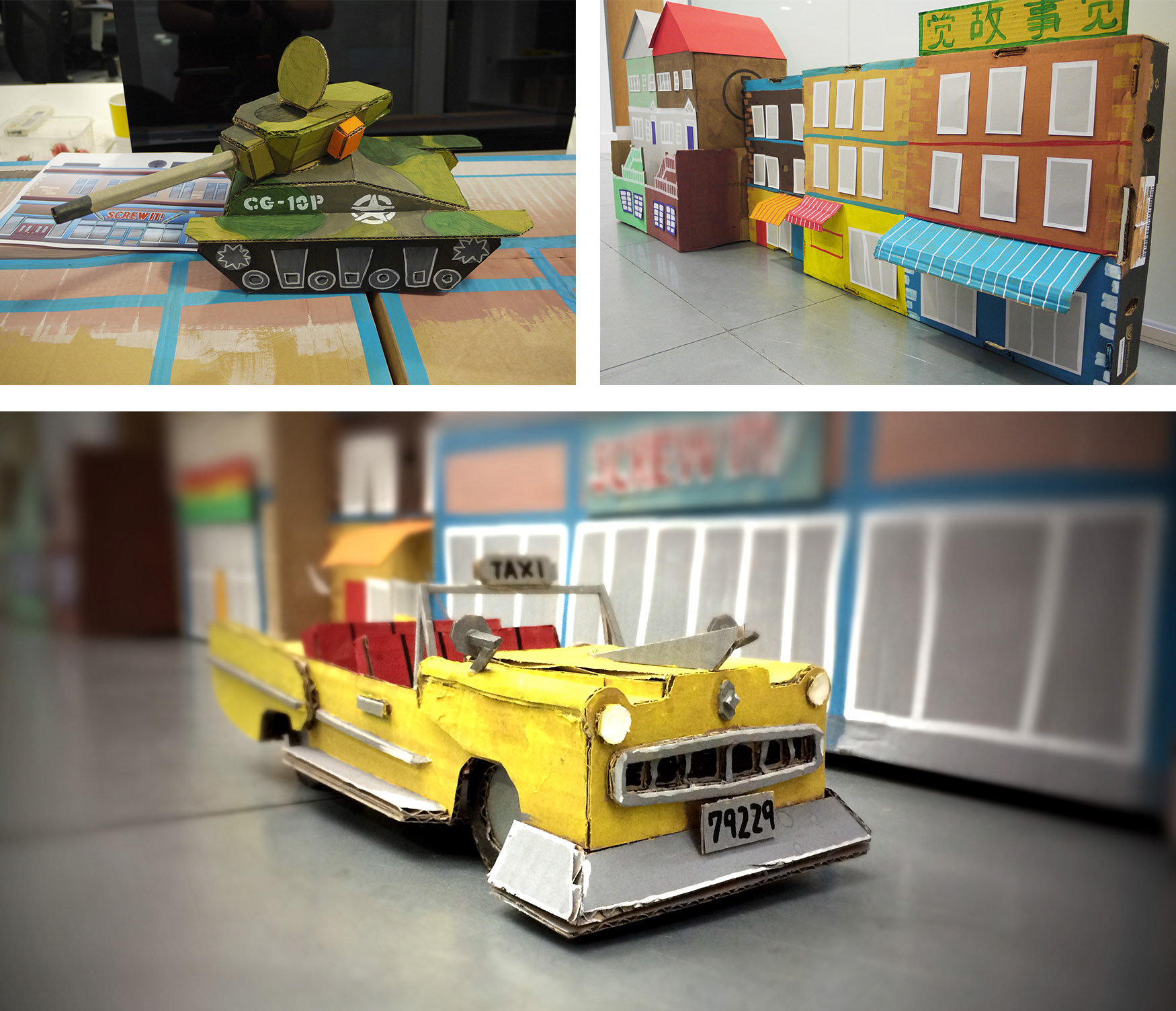
Crazy Taxi: City Rush. Work In Progress. Cardboard and Acrylic paint.